
Untangling the AT
My goal is to locate people on the AT, so the first thing I need is a good map of the AT. Fortunately, the Appalachian Trail Conservancy (ATC) maintains GIS data describing the path of the AT and makes it available on its website. I was hoping to get started by downloading the GIS data, and then converting it to a format that I can use more easily. However, I found out that that wasn’t going to be straight forward.
The ATC distributes GIS data in shapefiles, the format used by most GIS software, like ArcGIS and QGIS. The shapefile format is regulated by the ESRI, which published documentation about it. Shapefiles are a mixtures of headers and binary data. Fortunately, I did not have to write my own program to read them because there are many open-source options available. Fiona, Django, and Pandas all have functions for reading shapefiles. I decided to use Pyshp because it’s simple and it only has the features I need with nothing extra.
The ATC shares three shapefile documents describing the AT, one showing the centerline, one with shelters, and one for parking. I started with the centerline, because that’s the one showing the course of the AT. So I loaded the centerline using Pyshp and had a look. The first thing I noticed is that the centerline file is divided into 3,357 sections. The average section is less then a mile long, but some of them are longer. Here is the distribution of section lengths in a histogram.

The bulk of the sections are very short. The longest section is 10.3 miles. So it seems the trail is broken into very small pieces. I tried plotting the course of the AT, and here’s what I got.
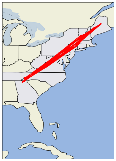
Clearly something is wrong.
First, the sections of the AT are not in any particular order. My first thought was that maybe I’m reading the shapefile wrong. So I had a look at the ESRI documentation, and I found that there was a an order label on each section. I had a look at Pyshp and saw that it was discarding the order number. So I modified it to include the order as a field… and I found out that the order number was the same order I was getting anyway. So it seems the problem is that the ATC’s centerline data does not include an order parameter so I have to order the segments myself. I thought of a simple algorithm to do this: following the AT course like a hiker. Starting at springer mountain, I can look for the segment that connects. Then I can follow that trail segment to the end and look for the segment that connects there. So I wrote a program to do that and I got this result
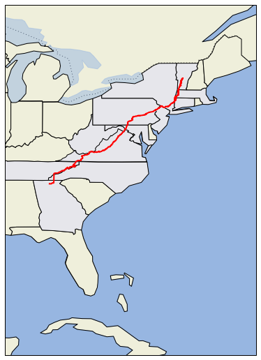
Much better, but something is still wrong. The AT is ending in Vermont, and some of the areas in New England look a little thick. So I had a closer look, plotting the segments as they were connected in the first few iterations of my program. I marked the current position with a black circle, and two candidates for the next segment in red and blue. The ends of the segments are marked with triangles.
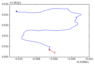
Everything looks good so far. I have the next segment in red, and the next-next segment in blue. So I move a little up the trail and…
 Ah ha!
Not all of the segments are ordered northbound! So I have to make my program a little more complicated, and try all the segments forwards and backwards. Here is the result:
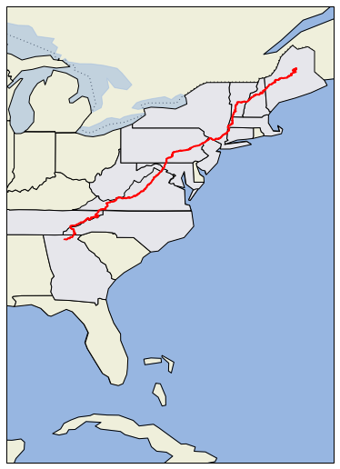
Everything’s great! Right? Well there is one small problem. There are still 7 segments left over. That is, when my algorithm was connecting segments, it didn’t find any use for 7 of the trail segments. They’re just left out. It’s like assembling a microscope and then seeing 7 screws lying on the table. Think those are important?
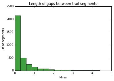
And another thing. Some of the gaps between segments are a little big. The biggest is 5.9 miles, which is alarming since I don’t think any gap should be larger than 100 feet. There’s not much I can do about this for now, except mark the anomalies and try to figure them out later.
Whew! All of my code is on GitHub