
US unemployment at different geographic scales
I’ve spent a few weeks using Pandas and I’m starting to appreciate just how powerful it is. I recently used it with geographic data for the first time, and that’s the topic of this post.
I’m working on a larger project, where I want to see the impact of different measures of unemployment on Americans’ political views. I hiked the entire Appalachian Trail last year, and it took me through a lot of communities that were suffering from long-term economic decline. I saw main streets with crumbling, empty buildings, and I had a lot of conversations with locals about local factories that closed. I also had a lot of interesting conversations about bear-hunting, but I’ll save that for another time.
Having spent 6 months in communities like this, I cringe when I hear experts talk about our “historically low” nationwide 6% unemployment rate. I don’t believe that this number reflects the way that many people are living.
My goal is to get a clearer picture by looking at metrics other than the unemployment rate, and to look at them at precise scales. Then I want to see if I can find a clear connection to voting behavior. My analysis will have to happen at a few geographic scales. Presidential primary results are counted by county, so I need county data to analyze primary votes. Senate and House races are done by state and congressional district, so I need to be able to work at that scale as well.
My first step was to gather unemployment data and cartographic files from the US Census Bureau. Fortunately, it’s quite easy to get these data files.
I processed the data using Pandas and plotted it with Vincent. Processing them was a little harder, so I wrote a little library to import census data and link it to shape files. I put my code on Github to help out my classmates who are also working with political and economic data.
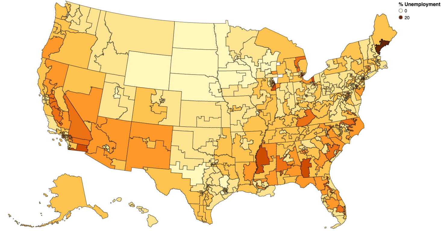 |
I looked at the data first by congressional district. Here we see values ranging from 3% to about 19%. Unemployment looks very low in the Dakotas and Minnesota, and it is highest in parts of the Deep South and California. Southern Maine has a pocket of extreme unemployment. This map has a couple of odd features: my home state of Maryland is mishapen, and Lake Michigan is missing. I think this is because bodies of water like the Chesapeake Bay and Lake Michigan are included in congressional districts, so this map does not adhere strictly to land boundaries.
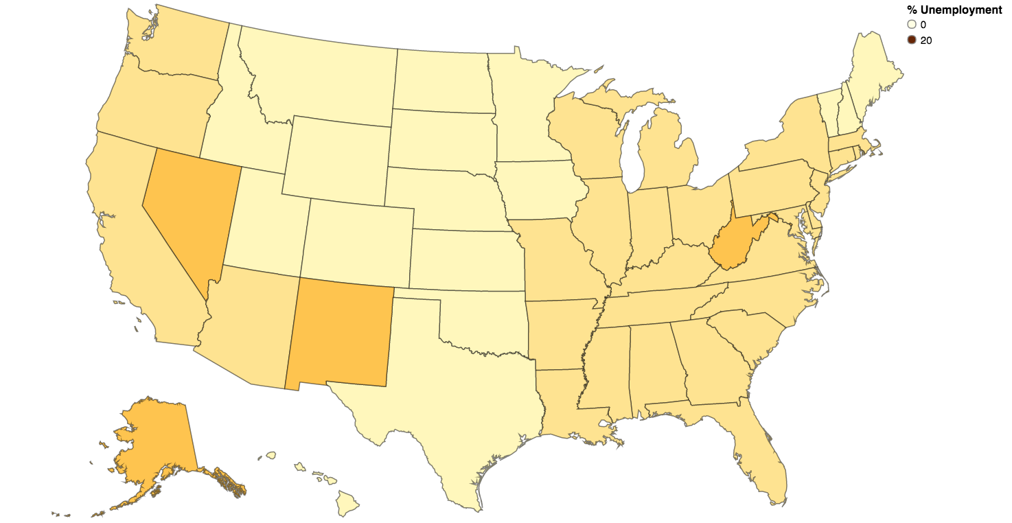 |
At the state level, unemployment looks lower across the board. I preserved the same coloring scale so it would be easy to compare the maps. State-by-state, the highest rate of unemployment is only 8%. Right away, this shows a big hazard of looking at the nation-wide unemployment rate. The average does not show that some areas have it much worse than others. Furthermore, the national average is weighted per-capita, meaning that it puts more weight on cities. If you drive (or walk) across the country, you will spend most of your time in less-dense areas. The spatial average of unemployment is considerably different from the per-capita average.
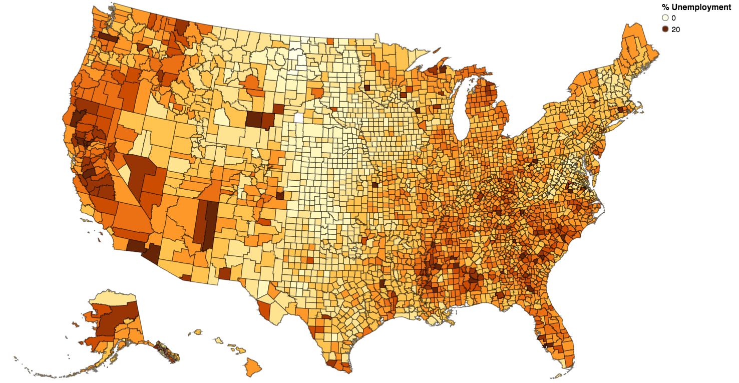 |
I preserved the 0-20 range but there are actually 22 counties that exceed 20% unemployment. Looking at the numbers, only 3 of these counties show up on the map because 19 of the 22 are in Puerto Rico. The three shown on the map are Kusilvak Census Area in Alaska (23.8%), Yuma County in Arizona (22.9%), and Imperial County in California (24%). The rest are in Puerto Rico so they aren’t shown.
Generally, the unemployment rate looks pretty bad on this map. This is related to the “spatial average” problem that I talked about before. But it also shows that, even as we have nationwide 6% unemployment, the economy isn’t great for everyone. Some people live in communities with unemployment rates as high as 24%. Maybe the disconnect between what these people experience and what they hear on the news causes them to seek out radical political remedies.